Project: The "What If" Metropolis - Thumbnails 72 to 87 - Composition Ideas
Get link
Facebook
Twitter
Pinterest
Email
Other Apps
-
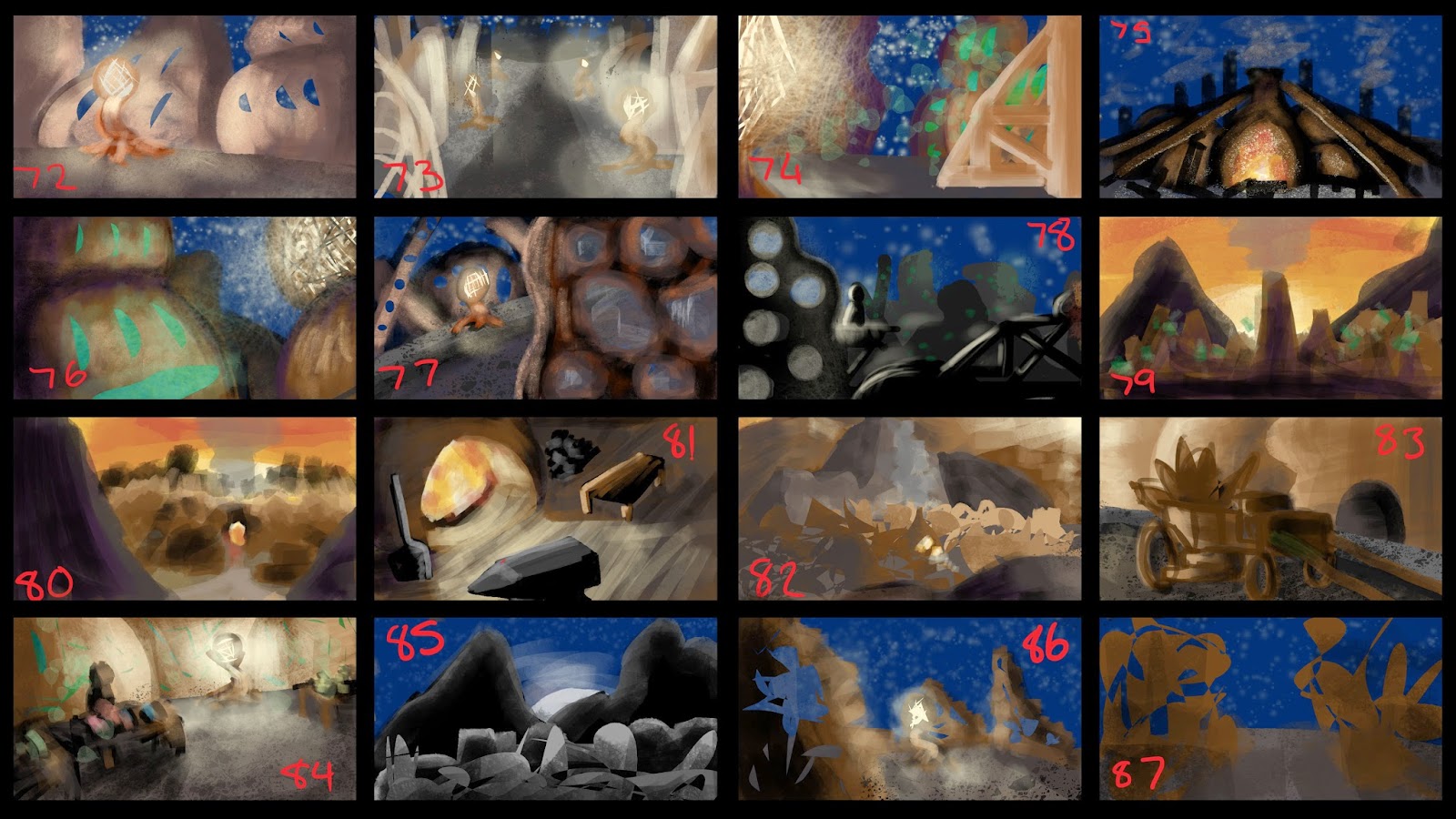
Ok so here I've made some thumbnails to consider the possible composition for my concept art. Let me know in the comments below what you think I should take forward. :)
Love these Chelsea!! Make sure you're including enough in your composition to communicate what your city is. Personally I like numbers 77, 82 and 80!
81 is more of a focus on props however, which I don't think could be efficiently as a whole piece of concept art to sum up your city, but definitely as a thumbnail to show props in use. :^D
It has been a while since you last saw any form of life along the dusty, barren pathway. The road ahead is a long one, and the rocky terrain at the foot of the towering mountains is a treacherous path to travel. Any traveller is advised to remain cautious of the cavernous depths of the mountains’ pathway. Trekking onwards, the path becomes thinner; more narrow, as you progress. But wait. You spy an opening. Perhaps a way out. The light draws nearer as you push forward, tip toeing between the tight spaces of the rocks and rubble scattering the path. It gradually becomes closer. You finally make it out. And there it is. Amplexus. Stumbling through the gap, you venture on to this strange environment. As you gaze upwards, you are only just able to decipher the peak of the monuments buildings aligned along the road into the city. Each building varies in height and shape. The abstract forms of the mass amount of structures leaves one puzzled, as it is difficult to determine where the en
Figure 1. 'The Incredibles Movie Poster' From the world famous Disney Pixar Studios comes an all time family classic about a super family forced to conceal their super identities to keep the world normal and safe. But when an unexpected force threatens the norm, it’s up to The Incredibles (2004) to save the day. Directed by Brad Bird, The Incredibles (2004) can be identified as a Hero’s Journey film, with examples of character archetypes that are associated with the Hero’s Journey concept. We begin our journey with Bob Parr, also known as Mr Incredible. He had a career as a superhero in his glory days, but then is reduced to the mundane life of a “normal” man after the Superhero race was cast out of society and forced into hiding. Bob is one of the main protagonists of the story, therefore he is also, ironically, the Hero . We journey with him to experience his ups and downs and his steps on becoming once again, Mr Incredible. He could also, in a way, be considere
Figure 1. Hercules (1997) The mythical wonder that is Disney’s ‘ Hercules (1997) ’, titled after the main character himself, has graced our screens for all these years, and yet, it still manages to dazzle our eyes with extreme colour and filled our ears with musical joy. Directed by Ron Clements and John Musker, it’s a perfect example of how to describe Joseph Campbell’s monomyth, The Hero’s Journey. The story begins with the birth of the Hero, Hercules, son of Zeus. With immense strength and cheerful disposition, the realm of Gods seemed tranquil for a moment with the new arrival to the godly line-up. However, that happiness would be short lived, when the ever jealous Hades, lord of the underworld, would turn the small child in to a mortal. Despite what the original Greek mythology states about the main hero himself, Hercules is a happy-go-lucky chap with high hopes and not much clue about the hero business at the beginning. After becoming mortal and being adopted by two


Love these Chelsea!! Make sure you're including enough in your composition to communicate what your city is. Personally I like numbers 77, 82 and 80!
ReplyDelete81 is more of a focus on props however, which I don't think could be efficiently as a whole piece of concept art to sum up your city, but definitely as a thumbnail to show props in use. :^D
I like 77 and 79, the colours really drew me straight to these.
ReplyDeleteI think 72 and 77 work really well in relation to your artist. 80 composition wise sticks out most to me and could work with these two. :)
ReplyDelete